Top 5 Ways to Keep Your B2B Web Lead Data Clean

Ardath Albee wrote that you can lift revenues 70% by cleaning up dirty prospect data. I don’t think we need much more of an incentive than that to start keeping our data clean.

CRM systems do many things extremely well. Deduplication of lead/prospect data, however, does not often seem to be one of them. The following are my four favorite things you can do to keep your CRM clean (at least in terms of the leads that come in from your site):

1. Automatic deduplication at the web form level — the same person filling out the form multiple times only creates one lead/prospect (but you still capture the activity).

2. Data validation at the form level — at the minimum, ensure that email addresses are in a valid format ([email protected], etc.). Even better is setting up your form to ping the domain in real-time and ensure that it has an actual mail exchange record. The latter method prevents people from entering things like [email protected] (which would pass the first test). At my company we take this one step further and actually do not accept free/ISP email addresses. We do not want our sales reps following up with Yahoo! or Gmail addresses.

If the visitor’s email address fails validation, be sure to provide a soft error (see below) message as soon as they tab off of the field as opposed to having them click the submit button, only to be surprised by a glaring error notification. 

(soft error example)

3. Limiting choices via drop downs instead of free-form text — this makes fields like industry, job title, etc. much more usable later as you will not get permutations of the same title (e.g. VP, Vice President, etc.). This also makes things easier for the visitor as he or she can typically fill the form out faster than with free text fields. 
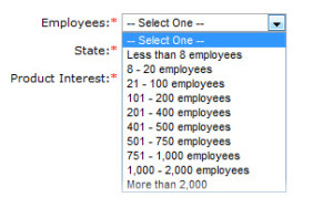
Predefined Field Values = Better Data

Predefined Field Values = Better Data

4. Keep bots away with built in spam prevention. If left unchecked, bots can quickly fill a company’s database with gibberish. Many companies (including Google) do this via captchas (an additional field where you enter a string of text or a number to prove that you are indeed a human). I prefer to instead use a hidden spam trap that humans never need to see or deal with. Captchas, while effective in term of spam prevention, can frustrate visitors and drive down your conversion rate.

So how do you do all of this?

Each of the techniques above can be accomplished with either some custom programming or via a marketing automation solution. Either way, the technology is out there and it will make your life easier and your data cleaner.

Guidelines for an Effective Subscription Form

Presenting potential subscribers with an effective opt-in form is essential in creating a good mailing list. The subscription form has two main goals: to collect enough information to begin a relationship and to communicate trustworthiness to the subscriber. Herein enters the trade off: how to request sufficient information without instilling distrust in the respondent? Kath Pay from Infobox offers a list of tips for optimizing your subscription form, which can be organized in terms of content, design and wording.

Form Content:

  • The initial subscription form should request the minimum amount of information necessary to begin a mailing relationship. Email address only or address and full name provide enough information for a basic personalized communication.
  • More information can be requested in subsequent e-mail interactions, once your subscriber has developed greater trust toward your mailings.
  • Optional form fields can also be used to request additional information. Pay recommends limiting optional fields to five, since anything greater will create the impression of an intimidatingly lengthy form.

Design:

  • Use error detection script to alert subscribers to information entered incorrectly. This minimizes faulty entries and maximizes the validity of your mailing list.
  • To the same end, include an extra field so the respondent fills in their email twice.
  • Include wide form fields so that the respondent doesn’t have to scroll from side to side, making it as easy and convenient for them as possible.
  • Use blank tick boxes so that opting in is an active choice. This prevents respondents from feeling like you are trying to cheat them and reduces spam complaints later on in the game.

Wording:

  • Clearly label whether a field is required or optional, so respondents are not needlessly intimidated by the breadth of the form.
  • Don’t use confusing instructions for checking tick boxes. The use of double negatives and other confounding tactics will make the respondent feel like you are trying to trick them.
  • Everything they are opting in to by checking tick boxes should be explicit in the text of the form, not hidden in the “Terms and Conditions”. Even though respondents are required to read this, they will still feel deceived when they encounter mailings they did not expect.

When a customer feels tricked and associates this with your company, it hurts your brand. In an increasingly connected market where word of mouth reigns, it is not worth it to pad your mailing list so your message reaches a greater number of people. Remember that, as far as mailing lists go, quality is absolutely more important than quantity. Following the tips listed above will help you maximize the relevance of your subscribers while optimizing their perception of your trustworthiness.

Landing Pages — Knowing when to say when.

Seth Godin just wrote an excellent post on designing effective landing or destination pages entitled “Seven tips to build for meaning.”

I would like to add one more item to the list:
Do not inundate your visitors with required (or even optional) fields.

Nothing frustrates me more as a visitor than arriving at a landing page, seeing a massive form and having most or all of the fields marked with the asterisk of death (denoting a required field). Companies who ask for more than a handful of fields in the first interaction are just encouraging drop off.

B2B sales by their very nature are often multi-touch and complex (read: not instantaneous). You, as a marketer, have a lot of time to flesh out your prospect’s profile and each touch point provides you with an opportunity to collect more data. Why rush to get everything up front?

The technological solution to this is using conditional fields. This technology allows you to progressively ask for just one or two data points during each interaction with a prospect, depending on the information he or she has already given.

Example:
Sally Smith hits your landing page and is asked for her name, email address, and company in exchange for a white paper. She is then asked for her job title before viewing your flash demo 20 minutes later. Three weeks later she is asked for her department in exchange for another white paper. Finally she is asked about her buying stage when requesting a live demonstration.

You set up the same form for all of your white papers, flash demos, and live demo requests, but you set them up to intelligently display only the fields that you are missing for a given prospect. Your marketing automation software identifies your prospects and remembers what information they have already given you.

Isn’t that a better experience for all parties?

Don’t Give Up Without A Fight

It takes a lot of work to get a prospect to your website. You probably put hours of effort in to crafting a compelling white paper or creating a fancy flash demo to lure visitors in to filling out your form. So once you’ve got them there, don’t let go! Urge them along by offering other items that may interest your target audience. This can be additional white papers, a special offer or a link to a free trial.

Guiding prospects to valuable items that require the visitor to complete another form allows you to use conditional fields, meaning you can collect a new round of prospect data points the second time, third or even fourth time around. This progressive profiling helps to build a more well-rounded customer profile for your sales team.

Even if you don’t have a large library of “locked-down” content to offer your prospects, providing links to other sections of your website can help you continue tracking your visitors and gain additional insight in to their level of interest. Additionally, providing links in the email you send your prospects upon form completion provides another opportunity to reengage those who have already left your site.

It all boils down to this: there is no reason to have your “thank you message” consist of nothing but a thank you. Encourage your prospects to continue the interaction by offering up additional opportunities for them to explore your company. If you are truly providing valuable content, it can only lead to a positive exchange of information for everyone involved.